Airbnb Property Investment Dashboard - Tableau Project
PROJECTS


Explore the journey of crafting a dynamic Airbnb dashboard, discovering the secrets of the rental market through Tableau visualizations. The project delves into key insights such as listing distribution, room types, and market trends. Learn how to enhance your Airbnb search experience with a meticulously designed dashboard for faster, informed decision-making. Join us on this exploration, unlocking valuable insights into the Airbnb landscape through the lens of Tableau.
If you want to practice Tableau following this tutorial, access datasets:
Project Overview
Client's Goal:
To kickstart her Airbnb venture, the client seeks a profitable property investment. Key considerations include location, number of bedrooms, and optimal pricing for maximizing profit. The objective is informed decision-making based on real data.
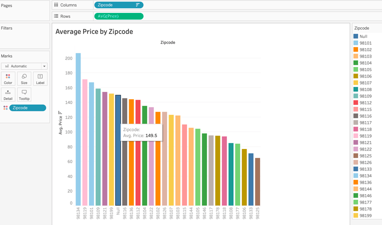
Graph 1: Price by Zip Code
Let's eliminate null values for price and zip code, since it's not relevant for the project.
Next, we calculate average prices per zipcode.
If you like this content and want to learn more, you might also read:
SQL Fundamentals for Data Analysis: A Hands-On Learning Series
Essential Technical Skills for Data Analysts
Transforming Data Into Insights
The Power of Data Visualization Tools: A Visual Journey through Insights
Notably, zip code 98146 stands out as the most expensive with an average price of $153.
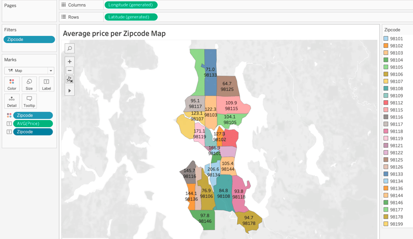
Graph 2: Average Price per Zipo Code Map
To create the map graph, there are many different data we could use to show location, such as latitude and longitude from dataset, generated latitude and longitude from some different fields, as well as states, zipcodes, country, city.
However, we want to stay consistent with what we are analyzing, so we are using zip code.
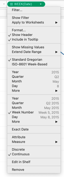
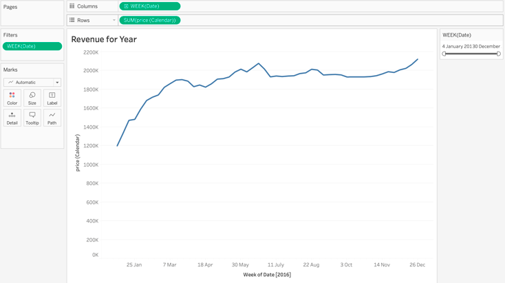
From this visualization, we can notice that the best time to rent the property is during the end of the year, since people go on vacation with family to celebrate de holidays, with a pick around 20/June, which we assume is the summer break in the USA.
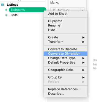
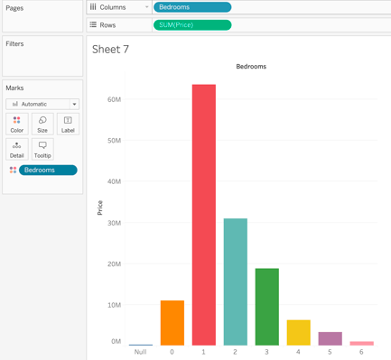
Facts that change prices in Airbnb: Number of bedrooms
Knowing the fact that the bigger the house, more bedrooms it has, and more expensive it will cost.
So, let’s see if it is worth it to invest in more bedrooms.
NOTE: As right now, the number of bedrooms is "values", and we want to change to "measure names" to evaluate the number of bedrooms, we must change it to "dimension", so we can use it as distinct number of bedrooms.
Graph 4: Listing Worth by Bedrooms
At this first analysis, with SUM(price), we are looking at the ones that bring the most money.
We can see that, when we add all 1 bedroom, they worth over $63M.
NOTE: Since I am in Australia, when I pulled up the map, values were unknown, I simply changed the country to USA on the bottom right.
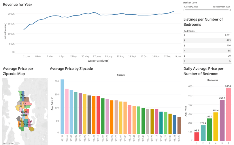
Graph 3: Revenue per Year
In this graph, we are checking when people are spending the most money in Airbnb.
We are using the “calendar” table.
For a better visualization, we keep the year, and by year, we are breaking it by week.

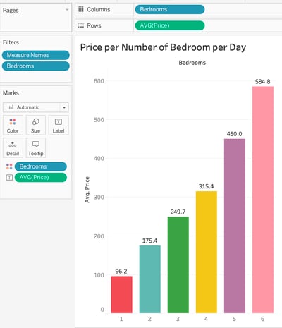
Graph 5: Average Price per Number of Bedroom per Day
In this next graph, we are excluding null and zero bedrooms because our client wants to have at list 1 bedroom for her investment.
As we can see, more bedrooms means that the property is more expensive since the house is bigger, probably nicer, and can fit more guests.
Graph 6: Number of Bedrooms Existing Listings
For our next analysis, we are focusing on the competition between number of bedrooms.
First, we want to count how many listings there are for each number of bedrooms, excluding null and zero.
Let’s use ID, which represents one location or one home. To properly use it, we need to convert them into distinct count, so we have the number of properties per number of bedrooms.

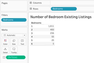
From this graph, we see that, more bedrooms, less competition in terms of listing.
It doesn’t tell us if there are a lot of demand for big properties, but it shows us how many properties are out there for each number of bedrooms.
Final Tableau Dashboard
It was a short and very simple overview of Tableau Dashboard project based on Alex The Analyst.
If you want to see the final real time dashboard, check out my Tableau Public profile HERE.