ECommerce Sales Interactice Dashboard Tableau Project
PROJECTS
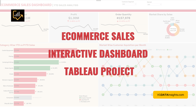
Today's project introduces an engaging e-commerce sales interactive dashboard for year-to-date sales analysis, commonly known as the current year sales analysis. The dashboard utilizes Tableau and incorporates dynamic filters for Market and Customer Segment, enhancing user customization. Action filters, a popular feature in Tableau, further enrich the interactivity.
If you want to practice Tableau following this tutorial, access dataset:
Project Overview
Ecommerce Sales project revolves around creating an interactive ecommerce sales daashboard focusing on year-to-date sales analysis, also known as current year sales analysis. The goal is to provide a comprehensive visualization of key performance indicators (KPIs) for effective business insights. Throughout this tutorial, we'll utilize Tableau to build an engaging and informative dashboard.
We incorporate two dynamic filters to enhance interactivity:
Market
Customer Segment
Additionally, we employ action filters, a popular feature in Tableau, to intensify user experience and engagement.
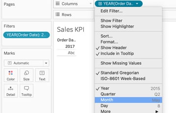
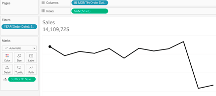
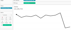
Chart 1: Sales KPI (Key Performance Indicator)
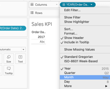
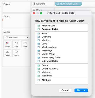
We start we the “order date” into columns, which shows us orders from 2016 and 2017. Since we are creating the current year sales analysis, we will be focusing on the latest date, 2017.
To filter it, we drag “order date” into filters -> years -> 2017
If you like this content and want to learn more, you might also read:
SQL Fundamentals for Data Analysis: A Hands-On Learning Series
Essential Technical Skills for Data Analysts
Transforming Data Into Insights
The Power of Data Visualization Tools: A Visual Journey through Insights
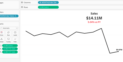
Next, let’s change year to month.
Then, place “sales” into rows, which brings a line chart.
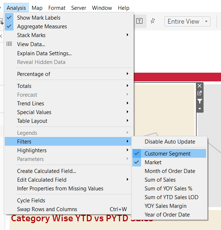
Lastly, let’s add filter checking market and customer segment, in dashboard as floating to place on top of the dashboard, as multiple values drop down menu, so we can check more than one option when we are filtering.
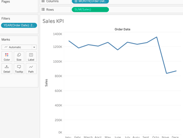

For what we want, we hide labels (x and y) and change the line to black.
Now, we want the sales values in the line, the year-to-date sales. There are few different ways to do that, but today we are using LOD.
In Tableau data visualization, Level of Detail (LOD) expressions compute values at both the data source and visualization levels. They enable the calculation of values with specific granularity, providing flexibility in analysis.
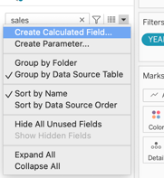
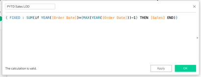
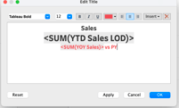
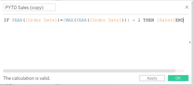
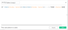
To create the calculation, click on “create calculated filed”, name YTD Sales LOD.
And create the calculation:
{ FIXED : SUM(if YEAR([Order Date])={MAX(YEAR([Order Date]))} THEN [Sales] END)}
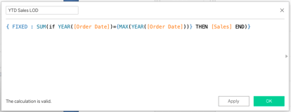

This Tableau calculation uses a FIXED Level of Detail (LOD) expression to sum the sales for a specific year, in this case 2017.
Let's break down the components:
FIXED:
Indicates the usage of a FIXED LOD expression, meaning the aggregation is performed based on the specified dimensions, regardless of the dimensions in the view.
SUM(if YEAR([Order Date])={MAX(YEAR([Order Date]))} THEN [Sales] END):
This part of the calculation filters sales based on the condition for a specific year, 2017. It compares the year of each order date to the maximum year in the dataset. If it matches, it includes the sales for that particular year in the sum.
If we were using the actual year instead of MAX(YEAR([Order Date])), we would have used YEAR([Order Date]). The MAX() function is employed to find the maximum value, which is useful when dealing with aggregated or summarized data, such as finding the maximum year. However, if we want to reference the actual year without aggregation, we simply use the YEAR() function on the [Order Date].
Since we are using a historical data, we must use this particular function.
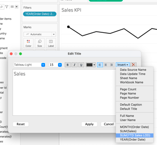
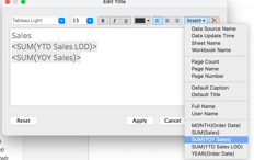
Now, let’s place YTD Sales LOD into details because we want to display sales into the title.
Similarly, let’s duplicate PYTD Sales LOD, name it PYTD Profit, and change “sales” to “profit per order”.
{ FIXED : SUM(IF YEAR([Order Date])={MAX(YEAR([Order Date]))-1}THEN [Profit Per Order]END)
Same with YOY Sales to YOY Profit %.
([YTD Profit LOD]-[PYTD Profit LOD])/[PYTD Profit LOD]
As well as YOY Sales Margin to YOY Profit Margin.
IF [YOY Profit %] >0 THEN '▲' ELSEIF [YOY Profit %] <0 THEN '▼' END
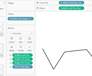
Let’s place YTD Profit LOD, YOY Profit LOD and YOY Profit Margin into detail, change currency, and Profit per Order into label.
With that, we can see the sales has been displayed.
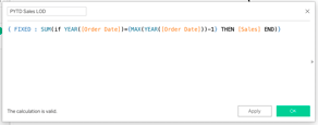
Now, we want to design year to year sales, meaning, from with respect previous year, how much the sales of the current year have increased or decreased by how many percentages by using a previous year to date sales analysis.
Let’s create a new calculation called PYTD Sales LOD (Previous Year to Date Sales LOD):
{ FIXED : SUM(if YEAR([Order Date])={MAX(YEAR([Order Date]))-1} THEN [Sales] END)}
The only difference here is that we are adding -1 that subtracts one year from the maximum year.
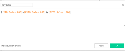
Next, we create a year-on-year sales calculation named YOY Sales:
([YTD Sales LOD]-[PYTD Sales LOD])/[PYTD Sales LOD]

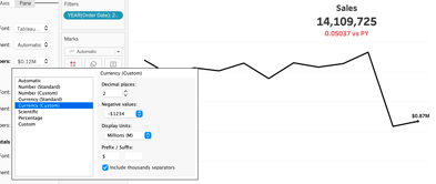
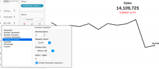
Then, for “sales” and “YTD Sales LOD” we change currency (custom) -> display units: Millions(M).
Place YOY Sales into details and change the title, same steps as before.
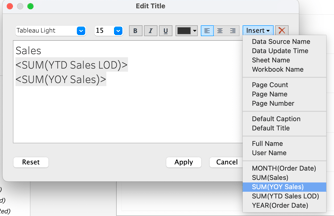
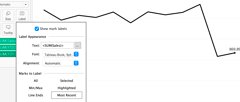
To format, we place “sales” into label, then click on “most recent” level.

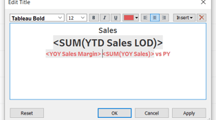
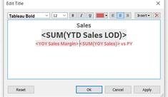
For better visual, we do some title edition.
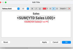
And “YOY Sales LOD” to percentage.
It will look like:
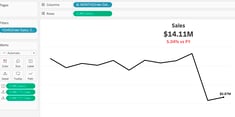
Next, we want to add an arrow indicating if percentage have increased or decreased compared to previous year by creating a new calculation named YOY Sales Margin.
IF [YOY Sales]>0 THEN '▲' ELSEIF [YOY Sales] <0 THEN '▼' END
To get the arrow, we go to word doc -> insert -> symbols -> find the arrows (▲▼) -> copy and paste as described above.
Drag YOY Sales Margin to “detail” and place it in title as shown below.
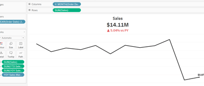

Our first KPI has been created.
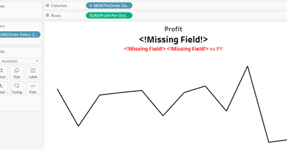
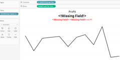
Chart 2: Profit KPI
To save time, let’s duplicate Sales KPI and start making the changes.
Rename worksheet to Profit KPI, replace “sales” in rows to “Profit per Order”, remove tables from marks and change title to Profit.
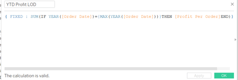
Let’s duplicate YTD Sales LOD, change the name to YTD Profit LOD and, instead of “sales”, we use “Profit per Order”.
{ FIXED : SUM(IF YEAR([Order Date])={MAX(YEAR([Order Date]))}THEN [Profit Per Order]END)}
Now, we can start formatting the title like we did previously.
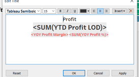
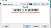
Now, we format the title as below.
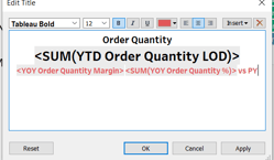
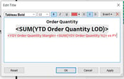
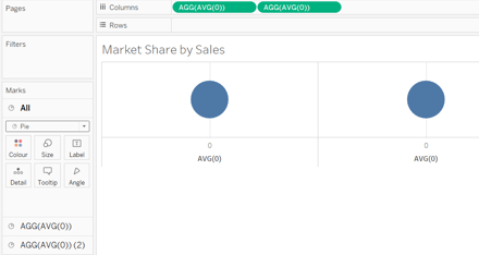
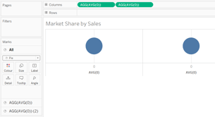
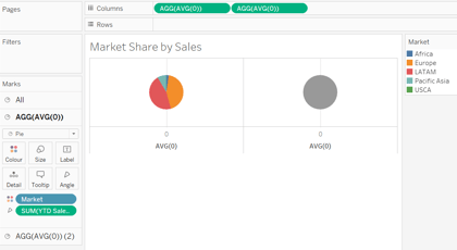
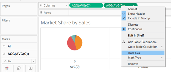
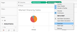
Chart 4: Market Share by Sales
For tis chart, we need to create 2 axis by writing “ave(0)” twice in rows, then make them as pie chart.
To make it a donut chart, we need to overlap both pie charts by clicking on “dual axis”.
Next calculation is the % difference:
(SUM([YTD Sales])-SUM([PYTD Sales]))/SUM([PYTD Sales])
Let’s place % Difference into label, changing to percentage the values.
Now, we label in a way that we can see if it percentage is increasing or decreasing, as well as colouring bars accordingly where increasing is green, decreasing is red and no sales in previous year is grey.
We start with a new calculation Sales Margin:
IF SUM([YTD Sales])-SUM([PYTD Sales])<0 THEN 'Less than PY'
ELSEIF SUM([YTD Sales])-SUM([PYTD Sales])>0 THEN 'Greater than PY'
ELSEIF ISNULL(SUM([PYTD Sales])) THEN 'No sales in PY'
END
We place Sales Margin into colours and change colours accordingly to described above.
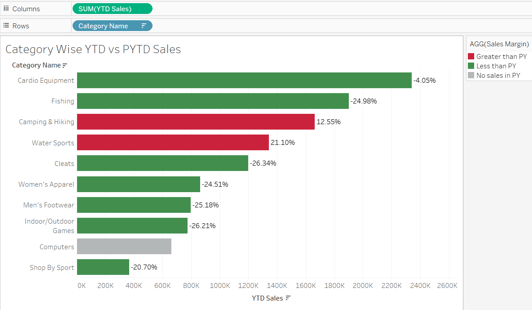

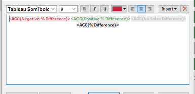
Also, we can add the arrows to the bars by creating 3 new calculations:
Positive % Difference:
IF [% Difference]>0 then '▲' END
Negative % Difference:
IF [% Difference] <0 then '▼' END
No Sales Difference:
IF [Sales Margin] = 'No Sales in PY' THEN 'No Sales in PY' END
Insert all new calculations into label and fix title as shown below.

To insert the label showing the YTD Sales per category, we duplicate YTD Sales in columns, remove everything from this new axis, colour it white and make it dual axis and move it to be axis 1. When they combine, format all (the axis that format both charts together) as bar. Don’t forget to change currency to millions (M).
The chart would look like below.
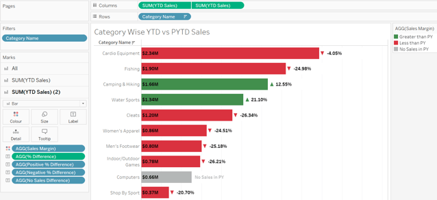

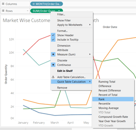
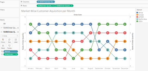
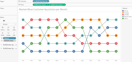
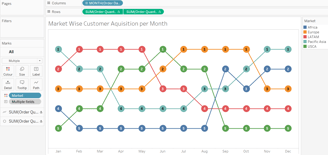
Chart 6: Market Wise Customer Acquisition per Month
To start, we place “Order Date” into columns and change it to months. Then, place “Order Quantity” into rows, and “Market” into colour.
Click on Order Quantity -> quick table calculation -> rank.
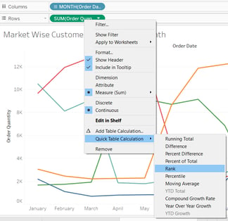
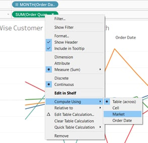
Click on Order Quantity -> Compute using -> market.
Make it a dual chart, then dual axis.
After, in the second axis, instead of line, we make it circle.
Next, place it into labels as centre and semi bold.
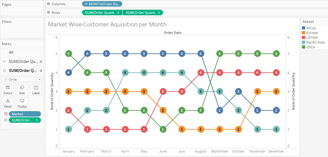
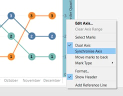
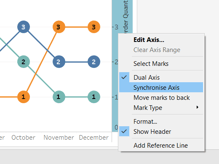
Let’s synchronize axis.
And reverse axis so 1 is on top and 5 on the bottom, remove all lines and abbreviate months for clean visualization.
Building Interactive Dashboard in Tableau
I am using resolution 1900 px x 950 px, but you can create according to your scream resolution.
Add dashboard title, drag vertical container and horizontal container to middle of dashboard. As well as blank so we can see how our containers are moving.
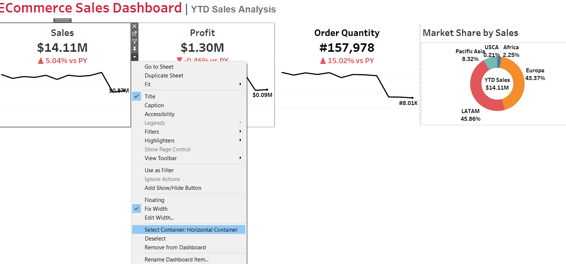
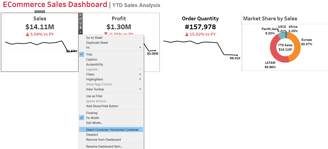
We place Sales, Profit, Order Quantity and Market Share by Sales charts on to of dashboard. Then, go to the drop down -> select container: Horizontal.
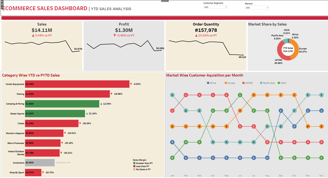
The final visual should look like below.
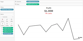

We can see that, in respect to 2016, 2017 profit has gone down by 0.46%.
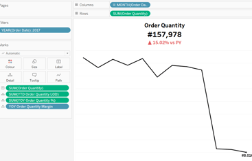
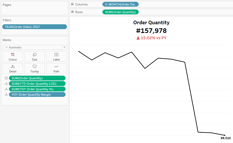
Chart 3: Order Quantity KPI
We duplicate Profit KPI, name it Order Quantity KPI, remove all tables, remove Profit Per order, replace with Order Quantity into rows, Change title to Order Quantity and start creating the new calculations.
YTD Order Quantity LOD:
{ FIXED : SUM(IF YEAR([Order Date])={MAX(YEAR([Order Date]))}THEN [Order Quantity]END)}
PYTD Order Quantity LOD:
{ FIXED : SUM(IF YEAR([Order Date])={MAX(YEAR([Order Date]))-1}THEN [Order Quantity]END)}
YOY Order Quantity %:
([YTD Order Quantity LOD]-[PYTD Order Quantity LOD])/[PYTD Order Quantity LOD]
YOY Order Quantity Margin:
IF [YOY Order Quantity %] >0 THEN '▲' ELSEIF [YOY Order Quantity %] <0 THEN '▼' END
Let’s place YTD Order Quantity LOD, YOY Order Quantity LOD and YOY Order Quantity Margin into detail, and Order Quantity into label.
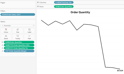
In this case, since it’s quantity, we are using numbers (#) instead of currency.
Final visualization below.
Then, we place “Market” into colors in the first axis, which creates a pie chart with all equal parts. We want to divide it according to the market sales. To do that, we need to create a new calculation, YTD Sales (year-to-date sales).
IF YEAR([Order Date])={MAX(YEAR([Order Date]))}THEN [Sales]END
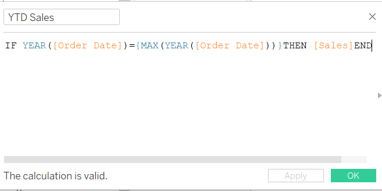
This Tableau calculation is checking if the year of the "Order Date" is equal to the maximum year of all the "Order Date" values. If the condition is met, it returns the value of "Sales." In simpler terms, it filters the data to include only the sales data for the latest year in the dataset.
This calculation is useful for scenarios where we want to focus on sales data specifically from the most recent year, making it easier to perform year-over-year analyses or comparisons.
Let’s take YTD Sales and place it into angle.
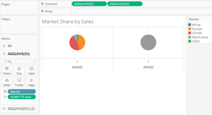
And we adjust sizes to look like a donut chart, change the grey colour to white and label by placing YTD Sales into label -> quick table calculation -> percentage of total.
Let’s we label market to be displayed and remove lines for clear visualization. As well as labelling the second axis with YTD Sales.
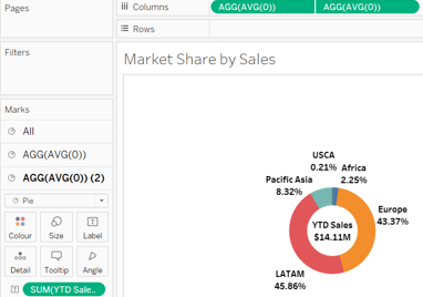
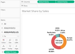
Chart 5: Category Wise YTD vs PYTD Sales
Let’s start this chart by placing “Category Name” into rows and “YTD Sales” into columns.
Next, we want to filter “Category Name” by field -> Top 10 -> YTD Sales -> Sum.
To add bar KPIs, we need to create a new calculation to show the YOY Sales percentage difference of sales called PYTD Sales:
IF YEAR([Order Date])={MAX(YEAR([Order Date]))} - 1 THEN [Sales]END
We just created a bomb chart that shows the placement of market according to the month.
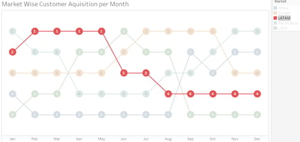
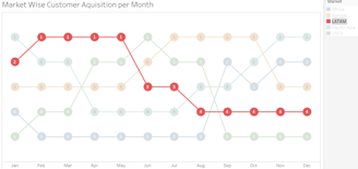
For example, if we click on LATAM, we can see that in January it was in second place in terms of customer acquisition, it was in first place compared to the other markets for 4 months in the row (February, march, April and May) and so on.
Again, drop down -> distribute contents evenly.
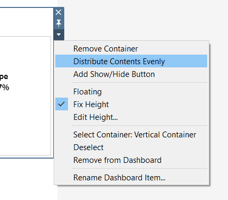
It will distribute charts evenly.
To change background colours, for each chart, go to layout choose the colours. Play around to make it clear and pretty.
Let’s add the legends for sales margin and market, both as float so we place them in the right chart. Market we format as a single row for a better fit.
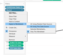
Next, we add the filter of market and customer segment by placing it to filter area in any of Sales KPI worksheet, apply to worksheets -> all using data source, for both. Also, add to context to both, because we are using the fixed LOD calculation which are only executed if we have filters.

Final dashboard.

It was a short and very simple overview of Tableau Dashboard project based on Data Tutorials.
To see the final real time dashboard, check out my Tableau Public profile HERE.