Tableau Data Analysis: Types of Charts and Graphs | When to Use Them
TABLEAU / POWERBI


Charts and graphs in tableau are beyond mere aesthetics, these visualizations are strategic tools, carefully designed for diverse data scenarios. Whether deciphering trends, analysing data distribution, or solving correlations, the utilization of specific charts becomes the key to crafting compelling narratives. Join us on this informing journey through Tableau's charting scene, where each graph serves as a gateway to revealing meaningful insights. Ready to dive in? Follow our tutorial.
Data visualization in Tableau opens a portal to a diverse array of charts and graphs offering a visual playground for data enthusiasts. These visualizations serve as more than aesthetically pleasing representations; they are strategic tools tailored to distinct data scenarios.
Knowing when to deploy a specific chart—be it for trend analysis, data distribution, or correlation exploration—transforms raw data into compelling narratives. Join us on this visual journey through Tableau's charting landscape, where each graph becomes a key to revealing meaningful insights.
If you want to follow this tutorial, access Superstore data at Tableau Public here.
Make sure to sign up for Tableau Public to create viz, share in the community, and get new ideas.
Bar chart in Tableau: Compare the data across different categories
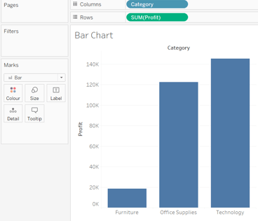

Structure:
Place categories into columns and profits into rows, creating a clear visual representation of the data distribution.
Representation:
Each bar in the chart represents a distinct category, and the height of the bar correlates with the corresponding profit or value associated with that category.
Insights:
Easily identify variations between categories, allowing for quick comparisons and highlighting trends or disparities.
When to Use:
Ideal for showcasing and comparing discrete data points across different categories.
Useful for illustrating changes in data over time or comparing magnitudes between categories.
Provides a straightforward visualization for stakeholders to grasp insights quickly.
In summary, the bar chart's simplicity and effectiveness make it a go-to choice when you want to compare data across different categories, offering a visual snapshot of key information.
Line charts: Compare data over periods
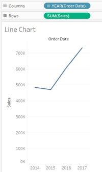
Line charts are an effective visualization tool for comparing data over periods, especially when examining order dates and sales. Here's a concise guide:
Structure:
Place order dates into columns and sales into rows, creating a clear representation of how sales evolve over time.
Representation:
Line charts connect individual data points, allowing for a smooth visual depiction of the trend in sales over the specified periods.
Insights:
Easily identify trends, fluctuations, and patterns in sales data, providing valuable insights into the performance over different time periods.
When to Use:
Ideal for showcasing trends in sales, highlighting peaks and troughs, and understanding the overall trajectory of performance over time.
In summary, line charts excel at comparing data over periods by visually connecting data points, making them an essential tool for analyzing the evolution of metrics like sales over specified time frames.
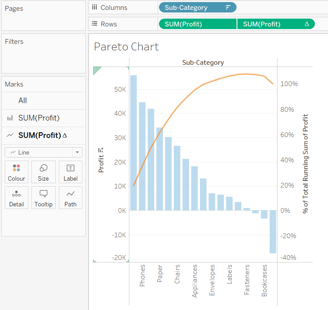
Pareto chart: Consists of both bar and line chart to identify the contribution of members that are present in a particular field.

If you like this content and want to learn more, you might also read:
Essential Technical Skills for Data Analysts
Power BI with SQL for Beginners
Power BI: Data Insights for Smarted Decisions
The Power of Data Visualization Tools: A Visual Journey through Insights
It’s a little more complicated as it involves the creation of two graphs. So, to create it:
Sub-category into column
Profit into row
Right click sub-category -> sort -> descending -> sort by: fields
Drag profit into rows to create double graph -> dual axis which will create circles
Select profit (1) -> select bar -> light blue colour
Select profit (2) -> select line -> change orange colour
Right click on rows profit (2) -> add table calculation -> running total -> sum -> compute using: table (across) -> add secondary calculation -> percent of total -> table (across)
Structure:
Bar Graph Format:
Pareto Charts adopt a bar graph structure.
Each bar represents different categories or factors contributing to a specific outcome.
Representation:
Descending order:
Bars are arranged in descending order of frequency or impact.
The leftmost bars represent the most significant contributors, following the Pareto Principle (80/20 rule).
Insights:
Identification of Significant Factors:
Provides a visual representation to identify the vital few factors contributing the most to a problem.
Enables focus on the most impactful areas for improvement.
When to Use:
Prioritization and Decision-Making:
Ideal for situations where a few factors significantly contribute to the majority of the issues.
Useful in decision-making to prioritize resources on the most impactful areas.
Commonly applied in quality control, process improvement, and problem-solving.
In summary, Pareto Charts structure information in a bar graph, emphasizing the most critical factors through a descending order representation. They provide insights into prioritizing efforts for maximum impact and are valuable tools in situations where a small portion of factors contribute significantly to outcomes.
Bullet Chart: Used as an indicator to show the performance of measures
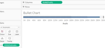
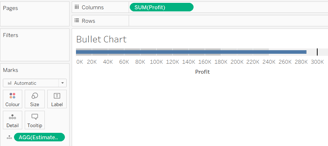
Structure:
Linear Format:
Bullet Charts present data in a linear format.
Typically consist of a single horizontal axis representing the performance metric.
Representation:
Components:
Composed of various components, including a performance measure, target measure, and possibly qualitative ranges.
Components are visualized as bars and lines, providing a concise representation of performance against targets.
Insights:
Performance Evaluation:
Facilitates a clear evaluation of performance against predefined benchmarks.
Allows quick assessment of how well a measure aligns with the set target.
When to Use:
Performance Tracking:
Ideal for tracking the performance of key measures or KPIs.
Suitable when there's a need for a visual indicator that quickly conveys whether a measure meets, exceeds, or falls short of the target.
Calculation and Usage:
Calculation:
Begin by creating a calculation, for example, Estimated Profit: ave(30000).
Select both the actual profit and the estimated profit.
Apply the bullet graph visualization to represent the calculated values.
In summary, Bullet Charts offer a linear representation of performance metrics, providing insights into how well measures align with targets. They are valuable tools for tracking and visually indicating performance, especially when a quick evaluation is essential.
Text Tables: Shows the exact value of measures across the different dimension
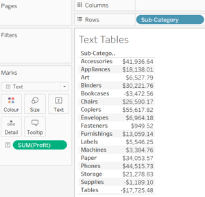
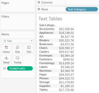
Structure:
Tabular Format:
Text Tables are structured in a tabular format with rows and columns.
Rows typically represent different dimensions or sub-categories, while columns display measures.
Representation:
Exact Value Display:
These tables precisely display the exact values of measures across different dimensions.
Each cell contains a specific measure value, providing detailed information.
Insights:
Detailed Information:
Ideal for presenting detailed and granular information.
Enables readers to examine exact measure values for each sub-category or dimension.
When to Use:
Granular Data Exploration:
Text Tables are effective when a detailed exploration of exact measure values is necessary. Suitable for scenarios where presenting specific numerical data is more critical than visual representation
Example Scenario:
Sub-category into Rows, Profit into Text:
To create a Text Table, organize sub-categories into rows and place the profit values into the text (marks) section.
Each cell in the table will then display the exact profit value for the corresponding sub-category.
In summary, Text Tables are valuable for presenting precise numerical information across dimensions. They offer a detailed view of measures and are particularly useful when a granular exploration of data is required.
Heat map: Visualizes the data in the form of size as well as colour on different measures

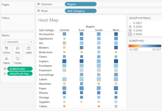
Structure:
Two-Dimensional Visualization:
Heat maps present data in a two-dimensional format.
Utilizes both size and color to convey information effectively.
Representation:
Size and Color Coding:
Size: Represents one measure (Profit Ratio) through varying sizes of elements.
Color: Reflects another measure (Profit) using a color gradient.
Insights:
Dual-Measure Representation:
Allows simultaneous visualization of two measures (Profit and Profit Ratio) in a single heat map.
Size variations and color intensity provide insights into both measures.
When to Use:
Comparative Analysis:
Ideal for comparing two measures across different sub-categories.
Offers a comprehensive view of the relationship between Profit and Profit Ratio.
Implementation Example:
Create Profit Ratio:
Start by creating a calculated field called Profit Ratio: SUM([Profit])/SUM([Sales]).
Select Sub-category and Profit, then choose the heat map visualization.
To enhance insights, map Profit to color (marks) and Profit Ratio to size (marks).
In summary, Heat Maps with dual representation using size and color are powerful tools for comparative analysis. They provide a visual correlation between measures, making them valuable for understanding relationships within data sets.
Waterfall map: visualizes the cumulative effect of a measure over dimension
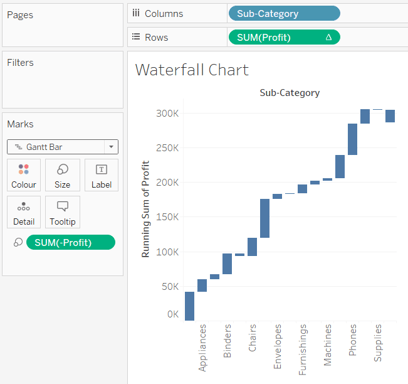
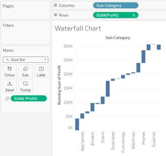
To create it:
Create a basic bar chart: sub-category into columns, profit into rows.
Right on profit from panel -> create -> calculated field -> name (-)Profit: -[profit]
Place (-)profit into size (marks)
Click on profit from rows -> quick table calculation -> running total
Change graph to Gantt Chart from marks
Structure:
Cumulative Effect Visualization:
Waterfall maps depict the cumulative impact of a measure over a specific dimension.
Emphasizes the flow and accumulation of the measure across categories.
Representation:
Bar Chart Foundation:
Initiate with a basic bar chart: Sub-category into columns, Profit into rows.
Utilize the bar chart as the foundational structure for the waterfall map.
Insights:
Running Total Calculation:
Create a calculated field, (-)Profit: -[Profit], representing negative profits.
Apply the running total quick table calculation on the Profit field to visualize cumulative effects.
Creation Steps:
Size Adjustment and Graph Transformation:
Adjust the size by placing (-)Profit into the Size shelf.
Transform the graph into a Gantt chart by changing the mark type to Gantt.
When to Use:
Scenario Analysis:
Useful for visualizing the progression and cumulative impact of a measure over different sub-categories.
Ideal for scenarios where understanding the flow and contribution of negative and positive values is crucial.
In summary, Waterfall Maps provide a clear representation of the cumulative effect of a measure, making them valuable for scenario analysis and understanding the impact of values across dimensions.
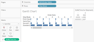
Gantt Chart: Used to identify the time taken for different categories
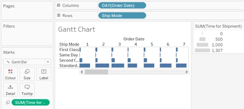
Structure:
Time Identification:
Gantt charts are designed to identify and visualize the time taken for different categories or tasks.
Representation:
Selection of Gantt Chart in Marks:
Initiate by selecting the Gantt chart in the Marks menu.
Column and Size Arrangement:
Drag the Order Date into columns, converting the time unit from year to day.
Perform analysis and create a calculated field, Time for Shipment:
DATEDIFF('day', [Order Date], [Ship Date]).
Size and Rows Placement:
Place Time for Shipment into the Size shelf in marks.
Drag Ship Mode into rows.
Insights:
Visualizing Time Taken:
Gantt charts provide a visual representation of the time taken for each shipment across different modes.
The length of the bars reflects the duration of the shipments.
When to Use:
Time-Driven Analysis:
Ideal for scenarios where understanding the duration or time elapsed is crucial.
Use when comparing the time taken for different categories or tasks is essential.
In summary, Gantt charts offer a clear and effective way to visualize and compare the time taken for different categories, making them valuable for time-driven analyses.
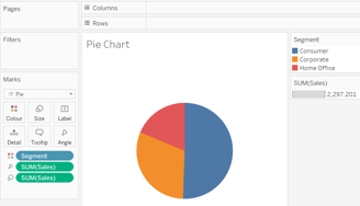
Pie Chart: Shows the contribution of measure over different members in a dimension

Structure:
Circular Division:
A pie chart represents the contribution of a measure over different members in a dimension.
Representation:
Segmented Circle:
It visualizes data using a circle divided into radial slices, with each slice representing a categorical value or member.
Usage of Segments and Sales:
Segments in the pie chart represent different members of a dimension.
Sales, as the measure, indicates the contribution or proportion of each segment to the whole.
Insights:
Contribution Visualization:
Pie charts provide a quick and intuitive way to understand how different segments contribute to the overall measure (e.g., sales).
The size of each segment corresponds to its proportional contribution.
When to Use:
Part-to-Whole Comparison:
Ideal for showcasing the distribution of a measure among various categories or members.
Effective when emphasizing the relative sizes of contributions within the dataset.
Limited Categories:
Best suited when dealing with a small number of categories or segments for clarity.
Not recommended for a large number of segments, as it may become less effective.
In summary, pie charts are valuable for visually representing the contribution of each segment to the overall measure, especially when the dataset involves a limited number of categories.
Scatter Plot: Shows the trend or relationship between different measures
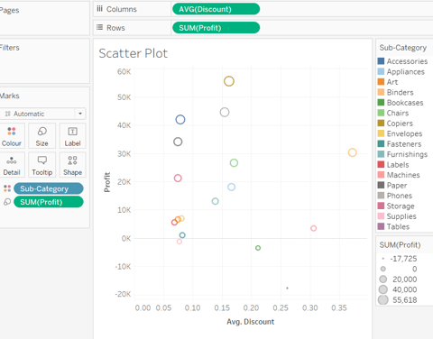
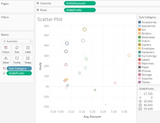
When we place discount into columns, sales into rows, then sub-category into colour (marks) and profit into size (marks), we create a plot showing the relationship between the discount and the sales for each sub-category.
Structure:
Data Points:
A scatter plot is a graphical representation showing the trend or relationship between different measures through individual data points.
Representation:
Axes and Points:
Typically, a scatter plot has two axes representing different measures (e.g., discount on the x-axis and sales on the y-axis).
Each data point on the plot corresponds to a specific combination of these measures.
Color and Size Encoding:
In your example, sub-category is encoded using color (marks), and profit is encoded using size (marks), providing additional dimensions to the visualization.
Insights:
Trend Identification:
Scatter plots help identify trends or patterns in the relationship between variables.
For your plot, it allows insight into how discount levels relate to sales across various sub-categories.
When to Use:
Relationship Exploration:
Ideal for exploring and visualizing relationships between two continuous variables.
Outlier Detection:
Useful for identifying outliers or unusual data points that deviate from the general trend.
Correlation Assessment:
Effective in assessing the correlation or lack thereof between different measures.
Comparing Multiple Categories:
When additional categorical data (like sub-category) can be incorporated through color or size for a more comprehensive analysis.
In summary, scatter plots are powerful tools for revealing trends and relationships between different measures. Your specific use case involving discount, sales, sub-category, and profit enhances the plot's depth.
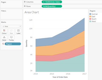
Area Chart: Represents any measure over different period

Structure:
Measurement Over Time:
An area chart is designed to represent the variation of any measure over different periods, especially useful for illustrating trends.
Representation:
X and Y Axes:
The x-axis typically represents the time (e.g., Order Date), while the y-axis denotes the measurement (e.g., Quantity).
Filled Area:
The chart uses a filled area below the line, making it easy to visualize the cumulative effect of the measure over time.
Color Encoding:
In your example, the region is encoded using color (marks), providing an additional dimension to the visualization.
Insights:
Trend Identification:
Area charts excel in identifying trends and patterns in data over time.
Magnitude of Change:
The filled area emphasizes the magnitude of change in the measure, showing both the overall trend and variations within the period.
When to Use:
Temporal Analysis:
Ideal for representing data that changes over a continuous period, such as sales, quantity, or revenue.
Cumulative Effect Display:
Effectively displays cumulative effects of a measure, showcasing both the individual values and their collective impact.
Comparing Multiple Categories:
Suitable when you want to compare the trends of the same measure across different regions, as indicated by the colour encoding.
Visualizing Patterns:
Use when the goal is to visualize patterns, fluctuations, or shifts in the measured variable.
In summary, area charts are powerful tools for revealing trends and variations over time, with the added benefit of colour encoding for regional comparisons.
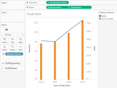
Dual-Axis Chart: Used to visualize two different measures in two different chart types
Structure:
Combining Two Measures:
A dual-axis chart allows the visualization of two different measures on a single chart, each represented with a different y-axis.
Representation:
Order Date and Measures:
In your example, selecting order date, quantity, and sales, and then opting for a dual combination chart, creates a chart where order date is on the x-axis, while quantity and sales are on separate y-axes.
Insights:
Comparison of Measures:
Dual-axis charts are effective for comparing two measures that might have different scales or units, offering insights into their relationships over time.
Correlation Examination:
The chart facilitates the examination of correlations or patterns between two distinct measures, helping identify trends and potential relationships.
When to Use:
Differing Scales or Types:
Ideal when the measures being visualized have different scales or represent different types of data (e.g., quantity and sales).
Enhanced Comparison:
Useful for enhancing the comparison of two measures by presenting them in their appropriate chart types, providing a comprehensive view.
Temporal Analysis:
Valuable for temporal analysis, such as comparing the quantity and sales trends over the order date.
Highlighting Relationships:
When it's crucial to highlight relationships or disparities between two measures, a dual-axis chart offers a clear and consolidated representation.
In summary, dual-axis charts are powerful tools when you need to visualize and compare two different measures effectively, especially when they require distinct chart types for accurate representation.
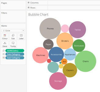
Bubble Chart: Visualizes the measures and dimensions in the form of bubbles

Structure:
Bubble Visualization:
A bubble chart visually represents measures and dimensions using bubbles. Each bubble represents a data point, and its size, color, and label convey additional information.
Representation:
Sales as Size:
In your example, the sales data is translated into the size of the bubbles. Larger bubbles represent higher sales figures.
Sub-Category as Label:
Sub-categories are used as labels for each bubble, providing context and identifying the category to which each data point belongs.
Colour for Distinction:
Colouring the bubbles based on sub-category adds another layer of information, making it easier to distinguish and interpret data points.
Insights:
Comparative Analysis:
Bubble charts are effective for comparing multiple dimensions simultaneously, offering insights into the relationship between size, color, and labels.
Multivariate Understanding:
The chart allows users to understand the interplay of different measures and dimensions in a single view, facilitating a more comprehensive analysis.
When to Use:
Size-Related Analysis:
Ideal for situations where the size of the data point (e.g., sales) is a crucial factor, and you want to compare it across sub-categories.
Visualizing Multidimensional Data:
When dealing with multidimensional data and wanting to visualize relationships among measures using size, colour, and labels.
Categorical Comparison:
Effective for comparing categorical data, where sub-categories play a significant role in the analysis.
Engaging Data Presentation:
Useful when you want to present data in an engaging and visually appealing way, adding depth to the representation.
In summary, bubble charts are valuable when you need to showcase the relationships between measures and dimensions through the intuitive use of size, colour, and labels.
Histogram: Show distribution of numerical data and its frequency
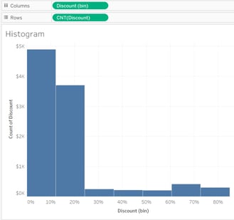
Structure:
Numerical Data Distribution:
A histogram is a graphical representation that shows the distribution of numerical data. It consists of bars where each bar represents a range of data values, and the height of the bar corresponds to the frequency of data within that range.
Representation:
Analysing Discount:
In your case, the focus is on analysing the discount. Each bar in the histogram will represent a range of discount values, and the height of the bar will indicate the frequency of occurrences within that discount range.
Insights:
Understanding Discount Distribution:
Histograms provide insights into the distribution pattern of discount values. It helps in identifying common discount ranges and understanding how frequently each range occurs.
Identifying Trends:
Patterns and trends in discount data become apparent, allowing for a quick visual assessment of the concentration of discounts within specific intervals.
When to Use:
Frequency Analysis:
Ideal for analysing the frequency or occurrence of numerical data, such as discount percentages, within different intervals.
Distribution Patterns:
Useful when you want to visualize the spread and concentration of values to identify central tendencies and outliers.
Comparing Ranges:
Effective for comparing the occurrence of discounts within various ranges and understanding the overall distribution shape.
Data Exploration:
Valuable during exploratory data analysis, especially when dealing with numerical data, to gain initial insights into its distribution.
In summary, histograms are powerful tools for visualizing and understanding the distribution of numerical data, making them particularly useful when analysing the frequency of discount values across different intervals.